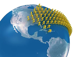
Here is a link to a map at The Economist that a friend of Judy’s sent today. It’s a map showing what percentage of citizens’ income is used for food/fuel/drink in most countries of the world, although its purpose is not to show immigration patterns, it is nonetheless instructive. Of course it’s intuitive that immigrants are flowing to North America, Europe and Australia because of the strong economies in those democratic and capitalist countries. I hope you find it as interesting as I did—to see economies depicted on a color-coded world map.